Launching one of the first juicieries based on the blood type diet.
The moment I walked into Asis Juicery, I saw the immediate moments of improvement for the space. A local juice bar, they had been in business for over a year and knew it was time for a rebrand. No longer going in a literal direction, we opted to play with a minimal aesthetic and design. The result? A beautiful space filled with character where the juice became the star of the show again.
Sustainable design solutions.
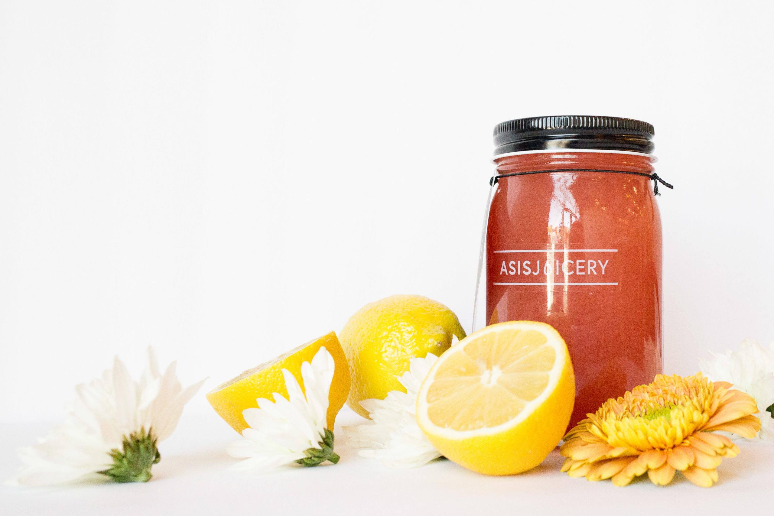
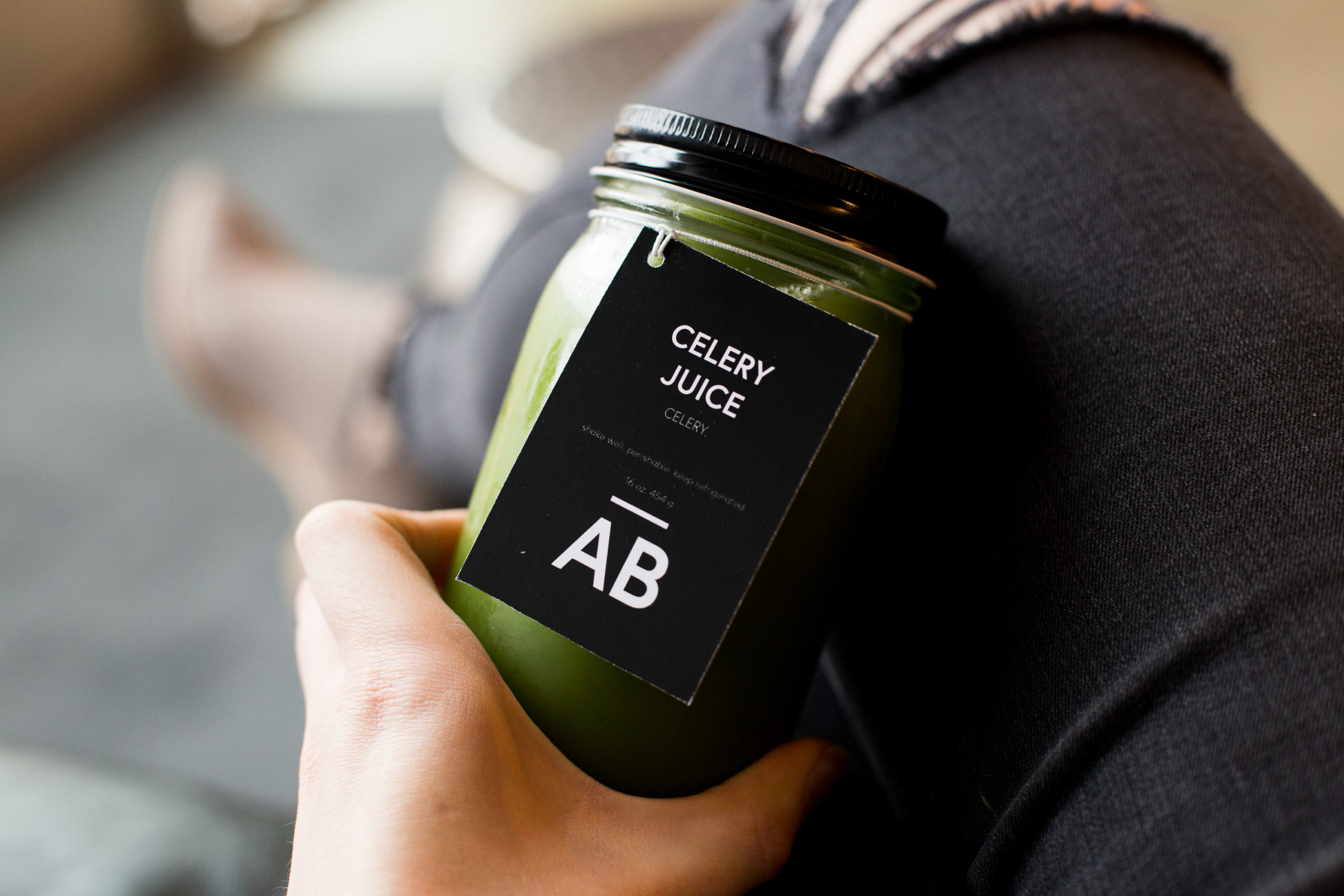
Like many businesses across the country, customers are waking up to the need for more sustainable packaging and are requesting businesses to follow suit. Sustainability is a strong core value for the owners who already were using glass jars as juice packaging. When it came to the rebrand, tackling the juice packaging proved to be challenge, staying within budget and state health code packaging standards, but I loved the result. Complete with waterproof clear labels with white ink and juice flavor tags. Yes, glass containers are more expensive; however, this solution keeps the juice packaging to zero waste and allows customers to return their bottles for credit on a future purchase.

Another major challenge within the space was the hard install of the interior.
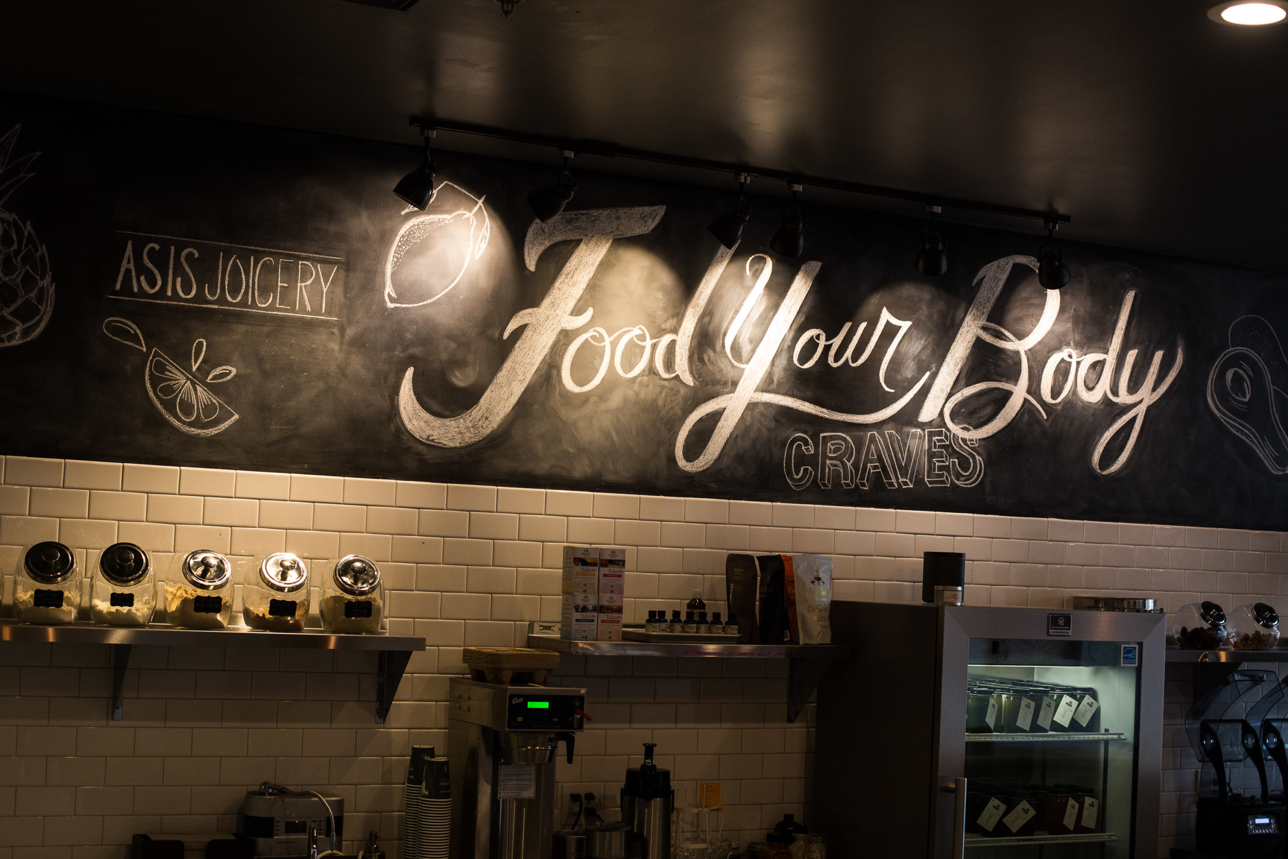
Prior to the rebrand, the menu board was 17 feet long and difficult to read for customers. For first time visitors to the space, it resulted in confusion and prolonging the order. There was an obvious solution-we had to get rid of the 17 foot menu board. It was stagnating the order process and was cumbersome at best. Because the space already had it’s hard install and we repurposed the chalkboard wall with hand lettering stating “Food Your Body Craves” emphasizing the new overall brand message. Throughout the rest of the interior, we removed artwork that no longer fit the ethos of the company, added a single stainless steel shelf within the prep space, placed the refrigerator case of juices behind the bar, added a plant wall, and a plywall merch wall. The result is a stunning and minimal space where color comes through the product. (Not to mention social media moments for customers to photograph throughout the space.)

Online ordering and website redesign.
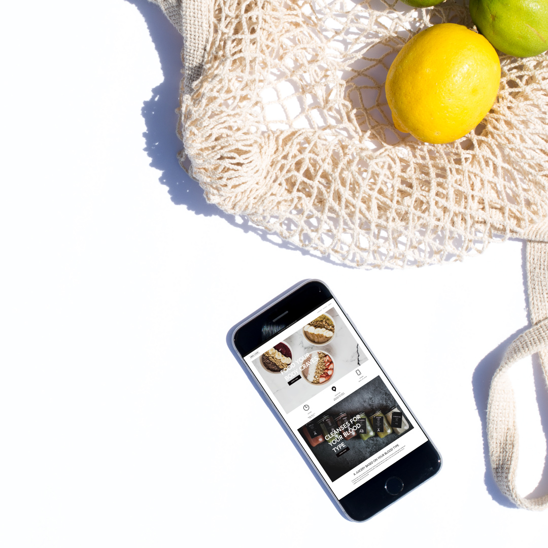
With the website, stunning custom photography was added and paired with online integration going to their Square POS within the store. (Now take out orders can be automated, increasing the scale of lunch hour, and allowing the kitchen to work much faster.) Saving time and money for the owners and customers, increasing overall sales cycles.

What we Did:
- Art Direction
- Social Media Management
- Food photography
- Handlettering mural
- Web Design
- Brand and collateral
