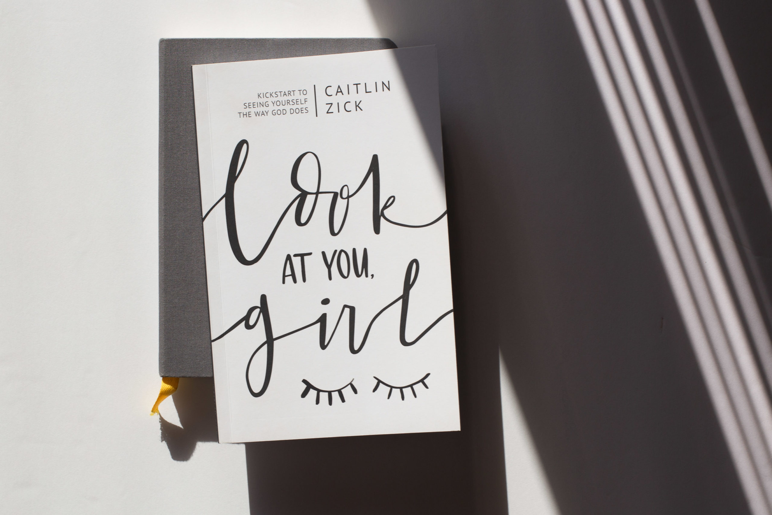
Book Design for author and speaker, Caitlin Zick

The design
When I first sat down with Caitlin, I asked her who she was designing the book for. As someone who speaks to a variety of ages, her response was quick and she didn’t miss a beat. Her reply, “Women ages 15-60.” With this in mind, we wanted to create something stunning and simple. Keeping a palette of black, white, and gray, her book is full of elements including a custom typeface that I was able to create. (This isn’t something I do often, but couldn’t wait to play and develop this skill.) I love the way it turned out and can serve her in marketing pieces for the book launch and social media for years to come. It truly is an asset that will keep on giving. Thinking through interactive elements as women worked through the guide, we created a set of custom icons that would serve as anchor points throughout each chapter. Knowing that we wanted the book to feel playful, for each chapter a set of illustrations were created emphasizing both activation and moments in the content itself. These illustrations will serve as Instagram assets when marketing the book as well. To finish out the book, double page vertical spreads were designed. These are social media moments for women to use and post about throughout the 7 days of using the book.
How We Helped:
- Interior layout and book design
- Product photography
- Custom illustrations
- Cover design with lettering from artist
- Custom typeface for use throughout book
