Transforming a website
into a trusted resource
for families navigating dyslexia.
How We Helped:
- Website and SEO Audit
- Website Copywriting
- Content Marketing
- Website Design
- Website Development
- Blog Migration
The Nashville Dyslexia Center offers online dyslexia tutoring for overwhelmed parents who are desperate for help with their child’s reading. They offer an incredible service to families nationwide. Our work with the Nashville Dyslexia Center included an audit, overhauling their website and social media consultations. The result? Clarity within their messaging and the user journey throughout the site.
Backstory:
When the Nashville Dyslexia Center started, a site was built with a DIY and scrappy approach. The ecosystem was different as well. At the time, the team offered both in-person and online support. When the COVID-19 pandemic hit, they pivoted their services to be entirely online – finding they were able to serve students around the globe and the tutoring was equally as effective. Over time, the website needed updates, that’s where we came into help.
Process:
After a kickoff call with the team, we began by completing a website audit, reviewing Google analytics and SEO analysis. The site hadn’t seen a significant update for years. The great news? The opportunities for SEO ranking, design improvements and conversion rate optimization were abundant.
The Problem:
At the start of our work. One problem became evident. Their messaging and naming was causing confusion. The founders would frequently receive questions like, “Are you a physical location? Where are you located? What do you do? And how do can you help my kid?”
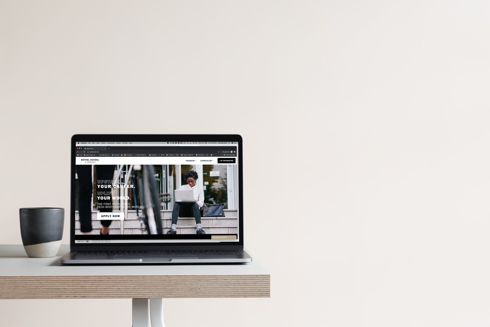
Was it a physical location? Building on an existing palette, there was one essential element to the current identity that was lacking- vivid color. Throughout the tech space there are two common lines of thought- mainly neutrals with a soft splash of desaturated color (think Apple) or the full spectrum of color (think Microsoft and Windows 10 updates). With the launch of the UI/UX Design program, an additional color needed to be added to the otherwise neutral and desaturated palette. However, it had to be the perfect shade of blue to remain cohesive. The blue we chose struck a medium ground between a cyan and cobalt, commonly used throughout the tech space and remains intuitive to the user within interactive design.
Web Design:
A focus on deliberate simplicity, this site was built with user empathy in mind. Knowing the needs and pain points of Bethel School of Technology’s prospective student, each page is filled with smart web copy, intuitive icons for the student, and screenflows simulating a in-class environment.
Client
Nashville Dyslexia Center
Location
Nashville, TN
Sector
Education
Child and Family Services
Services Rendered
Website Audit
Website Copywriting
Content Marketing
Website Design
Website Development
Blog Migration
Project Team
Melissa Jones
Somya Mishra