Harris. Trump. Obama. Biden. Bush. You know the names, but now it’s time to meet the company that helps them get to each stop of the campaign trail. Meet Premiere Transportation, the luxury transportation company responsible for getting them from point A to point B. 3816 Creative had the opportunity to work with Premiere Transportation with a rebrand and website and are thrilled with the results.
The Problem:
Premiere Transportation had 25 years of brand equity and has transported anyone and everyone over the years. From American Idol and on set of shows like Madam Secretary to presidential candidates on both sides of the aisle, their clientele is vast and offers an incredible experience throughout the journey. Over the years, the brand collateral and website felt stale and out of date, no longer showcasing the level of excellence and luxury service the company provides. Instead things felt thrown together and piecemeal over a period of time. That’s where we came in to help.
The Solution:
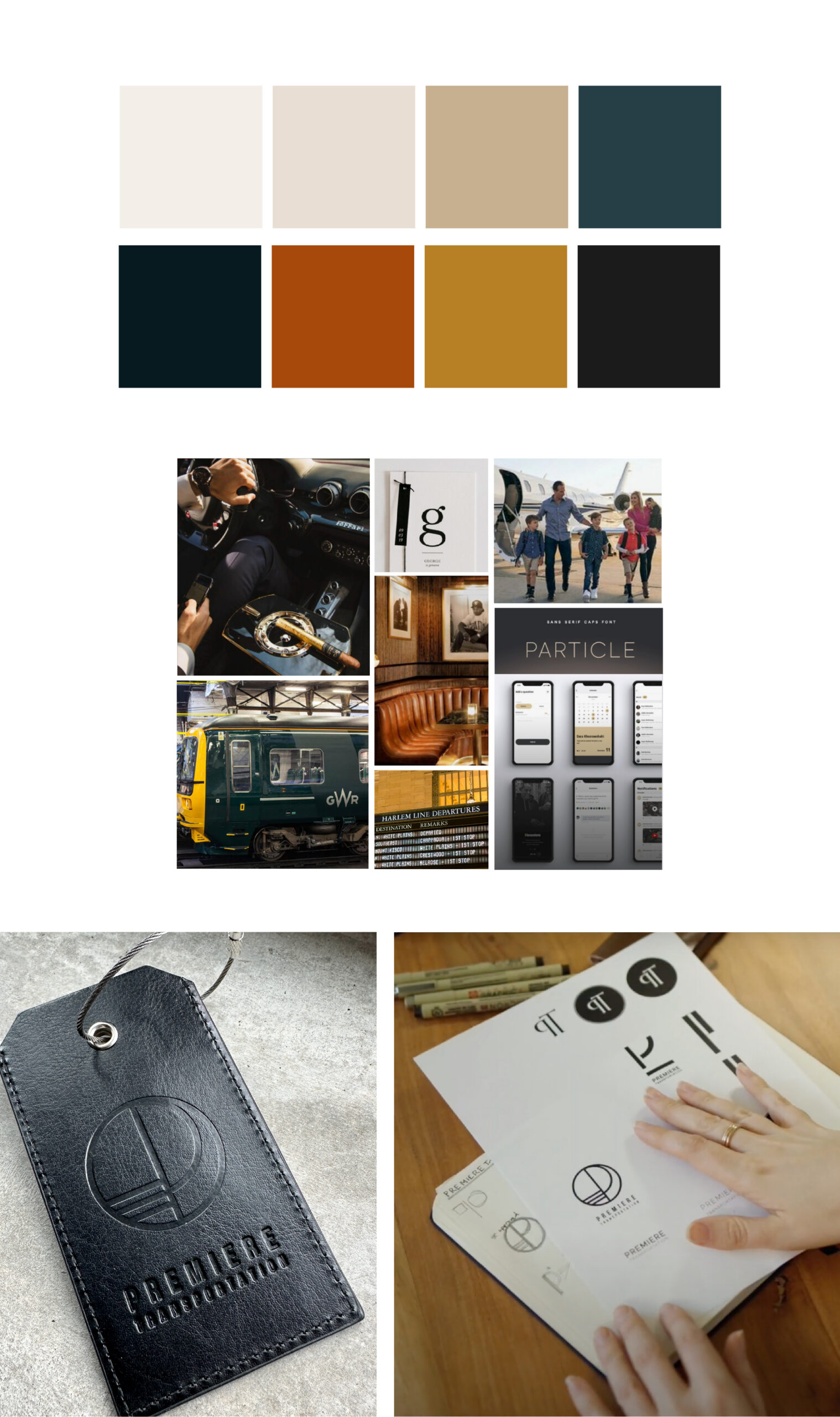
3816 Creative provided an A-Z brand build and touched everything. From brand strategy and positioning within the market to distinct library systems for each type of clientele (political, corporate outings, or personal celebrations), color palette, typography and a stunning website, we created distinct design library systems for each offer.
Here are a few key tips when it comes to rebranding a company with nationwide brand equity.
Tip #1: Creative discipline = design freedom
As we started working on the project, we noticed design choices that over a period of time no longer added to the strength of the brand or showcased the level of luxury of Premiere’s transportation services. We worked to streamline strategy and design choices that appealed to various ideal audiences, developing unique systems for each. We developed a design system for political clients, corporate outings and a general system for Premiere to use for ongoing use. I don’t like seeing a brand built for a client and leaving the client clueless with how to build out elements or implement the guidelines appropriately. Through unique design systems, Premiere understands how to incorporate guidelines for each market and use customer insights to adapt over a period of time.
Tip #2: Always design for mobile first.
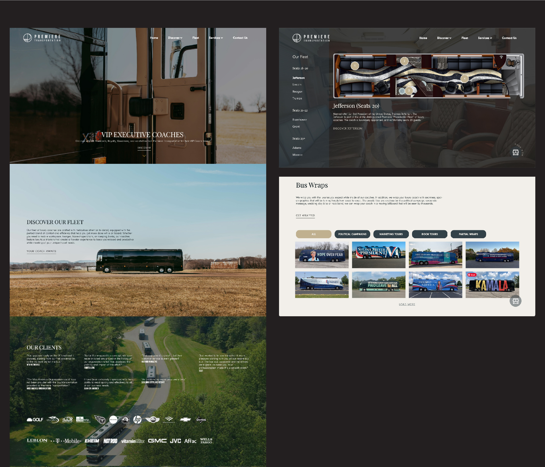
Over 70% of your customers will access your website on a mobile device first. When designing the Premiere website, we focused on a unique user interface and clarity for the user highlighting unique features of coach floorpans and increasing overall conversions.
Tip #3: Look back to go forward.
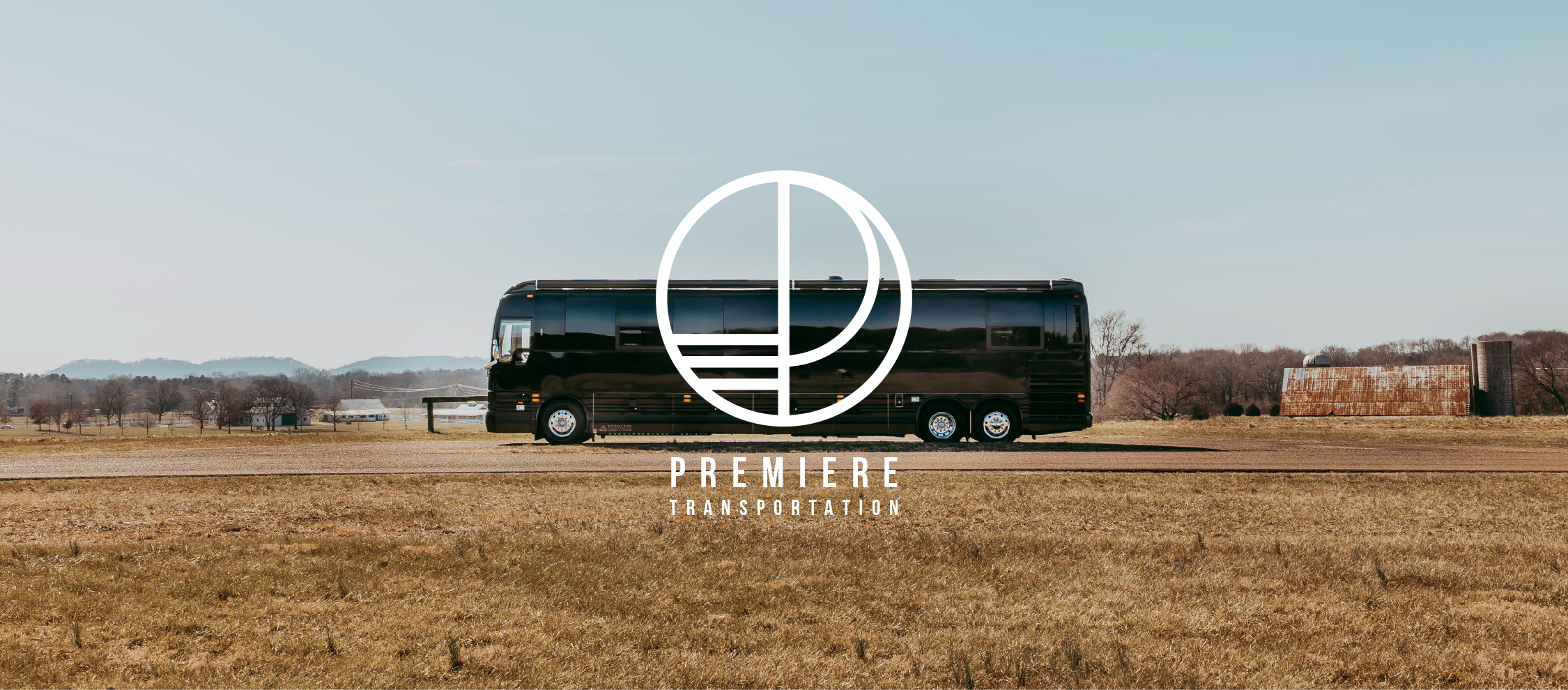
Inspired by the golden era of transportation, the rebrand of Premiere Transportation took notes from spaces like Grand Central Station. From the use of gold and opulence, a standard of luxury and art deco type, you’ll find inspiration that takes clear notes from the past while feeling distinctly modern. You’ll notice within the typography a narrow set width of each form and the spacing between letters allowing for breathing room and movement within the mark.
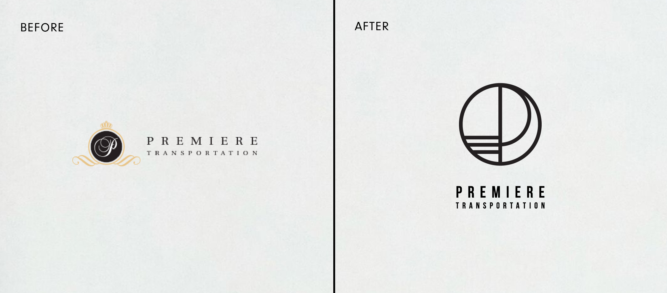
In the previous mark, an uppercase “P” was enclosed in a round frame. We’ve retained this element but have thought through a modern approach with an uppercase “P” with a low join on the vertical stem, it speaks to art deco typography.
The leading lines speak to a sense of motion and eras gone by.
Let’s chat about your project. Schedule a call.
Client
Premiere Transportation
Location
Nashville, TN
Sector
Luxury Brands
Professional Services
Services Rendered
Branding
Copywriting
Website Design
Project Team
Melissa Jones
Micah Burgen