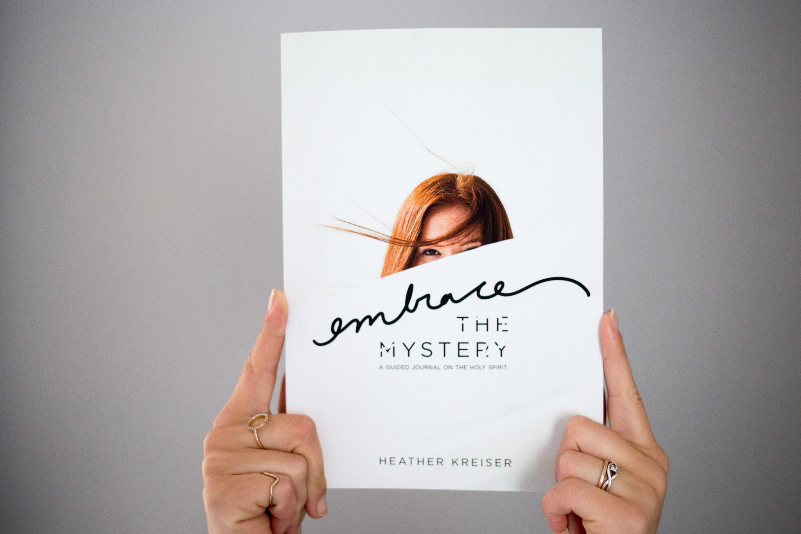
Embrace the Mystery
Book Design for Heather Kreiser, Author and Speaker
Pairing color with stunning imagery, handcrafted watercolors, collage styling, chapter pages, and effortless type setting, it was an absolute joy to bring Heather Kreiser’s first guided journal from Google Drive to life. In the 100 pages, the type setting embraced white space, while keeping things playful and feminine.

The design
When I first sat down with Heather, I asked her who she was designing the book for. As someone who has been around faith for many years, her response was quick. Her reply, “Women who long to know more of God and don’t know where to start. I want them to know the Holy Spirit, his person and power, unlike ever before.” With this in mind, we wanted to create a stunning and interactive user experience.Starting with the cover, playing with the idea of veiled and unveiled, the image draws you in through a use of deliberate type and organic line that is used as a graphic element throughout the book. Inside, pages unfold revealing color, hand lettered type, and a grid that plays with a repeated element of squares. But more than anything, there’s the conscious white space of a journal, grafting margin for the woman’s story to intersect line by line as her pen flows.
How We Helped:
- Cover and layout design
- Custom photography and visuals
- KDP Setup and Production
WHAT THEY’RE SAYING:
SO FUN TO WORK WITH YOU. I HAVE BEEN SO IMPRESSED WITH CLEAR COMMUNICATION AND CLEAR DEADLINES TO KEEP THE PROJECT PROGRESSING. THANK YOU. I CANNOT WAIT TO SHOW THIS PROJECT OFF.

< BACK TO THE BLOG